Mark wrote:
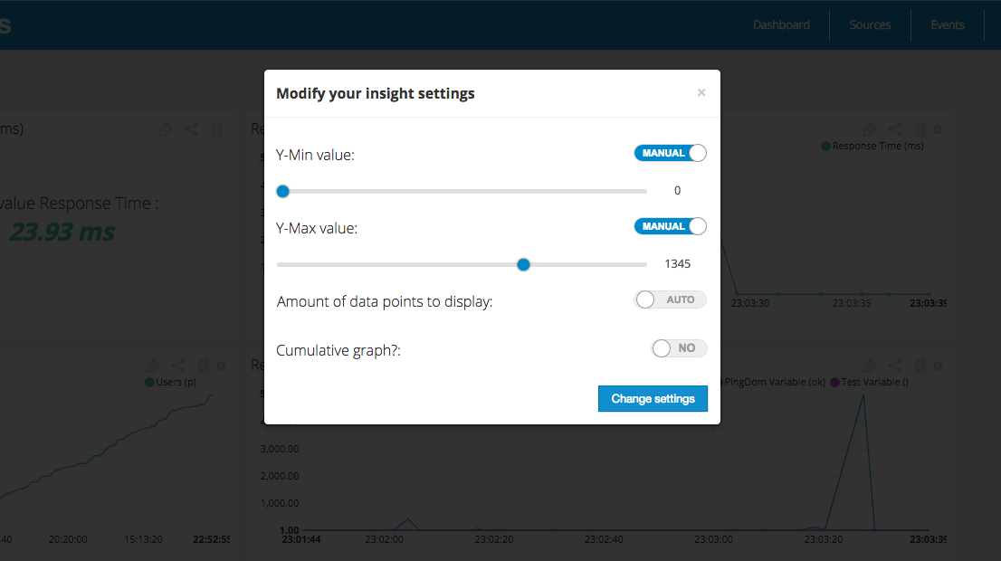
So, my problem was that when values are between (say) 310 and 320, the y axis will start at 310, and display a spiky graph, when the underlying variable is actually quite stable. I want to be able to look at my dashboard and see “ah, not too spiky, latency is fine”.